Friday 20 January 2017

Grade 9 CyberArts Culminating


Grade 9 Culminating


The style of HIP is a punk band combined with indie elements, meaning some songs are hard punk and some can be sort of layed back and calming. My five adjectives were layed back, hard, punk, loud, and exciting.

            I wanted something neon to act as my album cover, because the dark background with the light colours make my band's personality stand out. I also thought of an angry cat by thinking of my adjectives, so I decided to include it. I wanted a hard looking font to make the title in, so I chose the military-style stencil for my album cover. The cat is in the middle because I wanted it to be the main focus. I added the lines around the cat because I wanted to make it seem like the cat was loud, and the lines represent sound-waves coming from the cat. The colours are bright to represent the neon colours I wanted to use. The negative space is black because neon is usually seen on black in films, or it doesn't really show up. The different colours create unity because it's almost the full spectrum of colours in the rainbow.

            I used Adobe Illustrator to make the album cover with the pen tool. All photos are original, but the font used is not by me. I used the pen tool for the cat and it's outlines, using the curve tool to form the lines around the cat. I used Adobe Photoshop for the actual album, and I replaced the middle with black and then added HIP SOCCER MOM on the label. I then put them together in Adobe InDesign.

            I achieved what I was hoping for, as I wanted something that popped out from the background, and something that looked cool and represented my band at the same time. I really wanted an animal on the cover, and I wanted a bold text that popped out from the image.

Pinterest:
https://www.pinterest.com/mootoomeetoo/album-covers/

Friday 13 January 2017

Digital Surrealism


           1. The intended message of my piece is that people are too addicted to technology that they are too busy to notice anything out of their cellphone screens. I used a picture of Disha to represent the one who needs attention, and Gonzo and Darryn to represent the three people overly immersed in their devices. I used a picture of an abandoned hallway to represent the world being overlooked and abandoned because people are too busy giving attention to their devices.

            2. I first planned my picture in my sketchbook. I then took several pictures of Gonzo, Darryn, and Disha. I sorted them and proceeded to take the best ones and copy them to photoshop. I masked off the white background on all pictures and compiled them into one file. From there I set up the places and blurred out everything but Disha manually, to make the focus on her. I used the burn tool to make her shadow on the floor.

            3. I learned that shadows can make a big difference when it comes to realism in photoshop, because if there was no shadow for the photo it would look very bland and out of place. I am satisfied with the end result because I worked really hard and it came out really nice.

Monday 28 November 2016

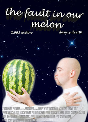
mfovie poster


I opened the image of the man and the watermelon in photoshop. I then quick selected the man and the watermelon and refined the edge. I then copied the layer mask and the picture and pasted it onto the movie poster screen. Then I made a new layer and pasted the space background. I then put in the title and the name in. Afterwards I put the credits in. The final stage I made the title 3d text.

Tuesday 22 November 2016

Photos


Rule of Thirds
This represents rule of thirds because as you can see Matthew is right along the points.

Fill the Frame
This is a good example because he is close to the camera and fills most of the frame.

Framing
This is a good example of framing because he is in the frame made by the diamond shaped fence.

Intentional Blur:
In this one, he is creating an intentional blur by dabbing.

Zoom Blur:
I couldn't quite capture the effect but this photo was taken while zooming into his face. 
Selective Focus:
As you can see the photo is focused on Matthew and not Yuri.
Panning:
I took this photo while panning while Matthew was running past the camera.
Leading Lines:
I made the photo black and white, and then used the burn tool to make the cracks in the road stand out more. I also made the 23 on his shoes red.
Pattern: 
This shows the pattern inside the shipping containers by the field.

PORTRAITS:
NO REFLECTOR
I like the way he's not looking at the camera, as it makes it seem more natural, like a camera wasn't there. The lighting was nice on this portion of the brick wall behind him, and I managed to expose it just right.

NO REFLECTOR
I like his jacket and the way it contrasts against the red brick background. He resembles the average working man, and once again he's not looking at the camera, so it looks more natural. I wish I could have straightened the background a bit more.


Thursday 10 November 2016

Composition

Rule of Thirds:

I picked this photo because it has a nice composition and demonstrates the rule of thirds nicely. It is spot on with the intersects.

Leading Lines:

I picked this picture for leading lines because it has many different examples on how they lead to the girl walking.

Fill the Frame:

I chose this photo because it shows that a good example and includes a common idea for photos; dogs.


Framing:

I chose this picture because it uses something that wasn't meant to be used as a frame, in this case a fence, and it includes a recognizable monument.


Monday 31 October 2016

DOF and Shutter Speed

SHUTTER SPEED:


This one has a very fast shutter speed, as it captures a bullet that is going very fast. It is less exposed than the one with low shutter speed.


This one has a very slow shutter speed as you can tell its been very exposed by the lights of the cars. If it were a high shutter speed it would capture each individual car.

DEPTH OF FIELD:


This photo has a very shallow depth of field, as the background is blurry and the cat's head and face are in focus. The cat's head is closer to the camera, making it a shallower distance from the lens. 


This photo has a very deep depth of field as it captures everything in the photo with no blur.


Friday 21 October 2016

OXCO Logo
Jamie Evans

Rough variations:


Final Variations:

(I'm not sure why that is bright pink, as you can see from everything else its not that intense.)


My Company:

OXCO provides 100% chromoly parts for BMX bikes. We provide frames, headsets, stems, forks, bars, etc. We target our marketing to people from 10 years old to 30 years old. Our style is that we're chill, urban, and "rad" to young people.

The Animal:

I chose the panda because it's know to be a very calm and 'chill' animal. This matches my company because we are supposed to target people that are chill and don't get mad often. My company is supposed to be layed back and easy to deal with. 

Choices:

I chose really rounded lines to form the shape of a panda head, with its tongue out. I chose thick-ish lines because it makes it look more cartoony and less elegant and rich people like. Thick lines are usually associated with cartoons, and cartoons are childish, and as you probably know, rich, elegant people are not usually very childish. They are very snobby and stubborn. I chose pink because pink is known to be tied with caring, and we want the buyer to know that we cared about our products while making them and they can trust that we worked our hardest on them. Hot pink, which is what I used, is known to be more playful and warming, so they know we're not some heartless company who don't care about their buyers. The shape of the animal is just a panda. I like how the ears, nose, and eyes are filled in, making it look very toned down and simple. I tried to add emphasis to only using pink, as I liked the colour psychology and eye-drawing factors of pink shades. I like how you can instantly look at it and know that its a panda. I used contrast in the typographic part of the logo, as it looked boring and half-done without another colour. So I changed one part of the word to hot pink, and the other colour to a lighter pink. It ended up looking nice so that is what I used.

Challenges:

I had a challenge using the pen tool, but after practicing, I ended up very good at using it effectively. 
I also had problems with nodes, but I kept trying different variations until I found what I liked, with a low node count. 

What did I learn?:

In this project I learnt how to use the pen tool in illustrator effectively to make an interesting logo. I also learnt how colours interact with each other and how to present typographic logos and pictographic logos nicely with each other.